How I Do What I Do
A STUDIO PAINTED LANDSCAPE
August 2, 2013
After a number of unavoidable distractions and surprise appointment I have final finished this little "how to", sometimes known as a WIP. The painting can be called finished, but I will put it away for a week or two, then pull it out and take a fresh critical look at it and make any adjustments as needed at that time. This is something I do with most of my paintings. This should give all a good idea how I work and maybe help them with something they have questions about. I hope it does helps you.
The support for this painting is an 18"x18" stretched oil primed linen, made by Claussens and is series #13 double primed. My palette will be built around a basic mixture of Holbein's Veridian Hue. This is the only "hue" I use. It is the color of Veridian, but also transparent like Thalo Green, but no where close to being as "potent" in mixing as Thalo Green. This will be mixed in varying amounts with Rembrandt's Transparent Red Oxide. These two colors form the base color combination. Think of it as a red/green complimentary mixture.
The complete palette is;
Utrecht White
Cad.Yellow Light
Permanent Alizarin Crimson
Transparent Red Oxide
Ultramarine Blue
Veridian Hue
Thalo Yellow Green....... This is a "convenience" color. If I added Cad. Lemon I could mix it with the Veridian Hue, but I would still be adding another extra (and expensive) color to the palette, so I use the tube color instead of mixing it.
Not shown here as it is about as interesting as watching paint dry, I have "toned" the canvas with a Veridian Hue, Trans. Red Oxide and a lot of white, just dark enough to "kill" the white. This mixture leans slightly to the cool side (green). I let this dry completely. Here in Arizona, that ain't long. About 5 days to a week and it is ready to begin painting on.
I tend to draw my larger masses with thinned paint. No pencil or charcoal. There are very rare exceptions, but "rare" is the active word.
 As can be seen in this first picture, it shows the masses I have scrubbed in using a #12 Bristle Flat brush from Trekel with TRO (Transparent Red Oxide). This is the only brush I will need until I begin making more opaque colors and I will mention when I do and what I use.
The odorless mineral spirits evaporates rather quickly. It is good to go and begin painting on within 15-20 minutes, at most. I have a fan blowing across the canvas and an air cleaner on the opposite side of the easel. This make for clean air, but with it moving causes the mineral spirits to evaporate faster.
Next I add the Veridian Hue to the TRO and using only the mineral spirits to make the colors values, so they are mainly for the darks an some underpainting that will tend to "glow" though the later layers of paint. This will be more apparent as the painting ages over the next few years. There are artists who will paint their entire canvas with Cad. Red Light and let it dry, then do the painting over it. It does make for a somewhat unique warm "glow" over the years as the colors of the actual painting becomes slightly translucent. This is common to all oil colors. Do not confuse this with the yellow of true Damar varnish that yellows as it ages.

Now, I am starting to fully establish my dark values. I am still using only mixtures of the Veridian Hue and TRO. The imaginary vertical line through the center of interest area is now very apparent. Notice the dark value just right of center in what will be the foreground, the indicated reflection up to the trees in the mid ground and then a branch of the tree nearer the foreground. Next you can see all the angles lead to the same area. The main area is just below center, but is not so noticeable just yet. It looks like it is cutting across the horizontal center line. It will not appear that centered when finished, though.
 Okay, now I am adding white to my Veridian Hue and TRO mixtures. Make note I have not indicated any detail what so ever at this point. I am establishing values and basic colors now. So far I have not used any other colors besides the Veridian Hue, TRO and White. I have also switched to using Mongoose flats from Rosemary and Company in the U.K. I am using two sizes a #4 primarily to begin with and a #6 for larger areas. There is still no detail. Please excuse the glare on the right side of some of the photos. It is "monsoon" season here Arizona and even my north light s changing due to the cloud movement and thickness. This has caused me to turn on a light for taking these photos, and causing the glare.
 I am now painting in the grassy areas and will move on to the trees, using the Mongoose flats.
 I have massed the main tree in and make a few experimental colors in the grass on the left side with the thought in mind of creating some variety in this area, but decide against this and will make the the variety a different, simpler way. With so much foliage in this painting this experiment would just be to "busy." I want this mass to be maintained, and will use a subtle value change that will also add some depth.
 The light in the studio is driving me crazy with the constant changing because of the fore mentioned cloud cover. So, I have been at this since 10:30 this morning and it is now almost 4 in the afternoon. I stopped after adding a variety of colors indicating lily pads, established a pattern for them, added more loose detail to bushes and trees. Finished the dark area of the water in the lower right foreground and added my signature so it dries with this area. I don't always do this but started after reading about a number of other artist doing it. Personally, I don't really think it matters. It is much easier doing this after the color under the signature is set up more. Note, there are still quite a few areas of transparent color showing. Again, the color shifts are caused by the changing lighting.
The next day, I received a early morning call from the VA, saying they had a cancellation and could get me in this day instead of waiting another week for some tests I need run, so I won't get started on the painting this morning.
I got home from the appointment around 3 pm. I am pretty tired after the trip down to the VA hospital (45 mile round trip), the tests they ran, and a quick stop at the grocery store. It never ceases to amaze and anger me, how little it takes to make me tired at my age. In my head I feel like I might be getting close to 30, but in reality I am approaching 72 with asbestos in my lungs making breathing difficult. So due to the late hour of the day and how I feel, I will get back on the painting in the morning.
 Finally after the VA appointment and then more unexpected distractions, I have got on with the painting. I have made a few marks indicating overlapping lily pads, variety of color, grass and foreground with more indications of detail There i not as much as it might appear. I have decided I don't like the way the main focal point is painted, the trees in particular. I made that bright greenish bush larger thinking I could cover some of the offending area, but to no avail. I like the bush, but I still need to work on the trees and the middle ground. The bushes on the left are also feeling to separated from the rest of the painting. So they need work.
I have also added some cad.yellow light and a few spots of Permanent Alizarin Crimson but kept it subtle. It is hard to see in the photos, I am sorry to say.
The gray colored trees and dead fall are mainly varying combinations of TRO, Veridian Hue, Alizarin Crimson and cad.yellow lt, and white of course. The majority of these trees are painted with a palette knife. I am closing in for the finale.
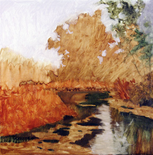
 So here we are. TA DA! Finished.......well for now. As stated in the preamble to this WIP, I will put this painting away for a week or two, then drag it out and give it a critical look over. I already see some areas that need some work. Some areas, I am pretty happy with. A few I need to look at them later and as I mention a couple of areas that I know need some fine tuning, but I want to do those with any other changes or tuning I do so as to keep everything in harmony.
The reference material I used for this was a quick and dirty pencil study done on location to close to sunset to set up and paint, and a couple of photos I took of this scene in 1997 while on a two month painting trip in Colorado, Wyoming, part of Montana then returning home I worked in some in Utah, before returning to the Phoenix area. This reference was okay, but certainly not optimum. I had no good accurate color reference for the area, so I was mixing intuitively and from memory in how I modified the photos colors. Boy! Do I miss being on location and painting a landscape.
If anyone has any questions about this WIP or any other questions about painting, I am happy to answer them or at least point you in the right direction and I hope this has helped someone/ Thanks for taking a look...... John
USING A LIMITED PALETTE
A STUDIO PAINTED LANDSCAPE
August 2, 2013
After a number of unavoidable distractions and surprise appointment I have final finished this little "how to", sometimes known as a WIP. The painting can be called finished, but I will put it away for a week or two, then pull it out and take a fresh critical look at it and make any adjustments as needed at that time. This is something I do with most of my paintings. This should give all a good idea how I work and maybe help them with something they have questions about. I hope it does helps you.
The support for this painting is an 18"x18" stretched oil primed linen, made by Claussens and is series #13 double primed. My palette will be built around a basic mixture of Holbein's Veridian Hue. This is the only "hue" I use. It is the color of Veridian, but also transparent like Thalo Green, but no where close to being as "potent" in mixing as Thalo Green. This will be mixed in varying amounts with Rembrandt's Transparent Red Oxide. These two colors form the base color combination. Think of it as a red/green complimentary mixture.
The complete palette is;
Utrecht White
Cad.Yellow Light
Permanent Alizarin Crimson
Transparent Red Oxide
Ultramarine Blue
Veridian Hue
Thalo Yellow Green....... This is a "convenience" color. If I added Cad. Lemon I could mix it with the Veridian Hue, but I would still be adding another extra (and expensive) color to the palette, so I use the tube color instead of mixing it.
Not shown here as it is about as interesting as watching paint dry, I have "toned" the canvas with a Veridian Hue, Trans. Red Oxide and a lot of white, just dark enough to "kill" the white. This mixture leans slightly to the cool side (green). I let this dry completely. Here in Arizona, that ain't long. About 5 days to a week and it is ready to begin painting on.
I tend to draw my larger masses with thinned paint. No pencil or charcoal. There are very rare exceptions, but "rare" is the active word.

The odorless mineral spirits evaporates rather quickly. It is good to go and begin painting on within 15-20 minutes, at most. I have a fan blowing across the canvas and an air cleaner on the opposite side of the easel. This make for clean air, but with it moving causes the mineral spirits to evaporate faster.

Next I add the Veridian Hue to the TRO and using only the mineral spirits to make the colors values, so they are mainly for the darks an some underpainting that will tend to "glow" though the later layers of paint. This will be more apparent as the painting ages over the next few years. There are artists who will paint their entire canvas with Cad. Red Light and let it dry, then do the painting over it. It does make for a somewhat unique warm "glow" over the years as the colors of the actual painting becomes slightly translucent. This is common to all oil colors. Do not confuse this with the yellow of true Damar varnish that yellows as it ages.

Now, I am starting to fully establish my dark values. I am still using only mixtures of the Veridian Hue and TRO. The imaginary vertical line through the center of interest area is now very apparent. Notice the dark value just right of center in what will be the foreground, the indicated reflection up to the trees in the mid ground and then a branch of the tree nearer the foreground. Next you can see all the angles lead to the same area. The main area is just below center, but is not so noticeable just yet. It looks like it is cutting across the horizontal center line. It will not appear that centered when finished, though.


The next day, I received a early morning call from the VA, saying they had a cancellation and could get me in this day instead of waiting another week for some tests I need run, so I won't get started on the painting this morning.
I got home from the appointment around 3 pm. I am pretty tired after the trip down to the VA hospital (45 mile round trip), the tests they ran, and a quick stop at the grocery store. It never ceases to amaze and anger me, how little it takes to make me tired at my age. In my head I feel like I might be getting close to 30, but in reality I am approaching 72 with asbestos in my lungs making breathing difficult. So due to the late hour of the day and how I feel, I will get back on the painting in the morning.

I have also added some cad.yellow light and a few spots of Permanent Alizarin Crimson but kept it subtle. It is hard to see in the photos, I am sorry to say.
The gray colored trees and dead fall are mainly varying combinations of TRO, Veridian Hue, Alizarin Crimson and cad.yellow lt, and white of course. The majority of these trees are painted with a palette knife. I am closing in for the finale.

The reference material I used for this was a quick and dirty pencil study done on location to close to sunset to set up and paint, and a couple of photos I took of this scene in 1997 while on a two month painting trip in Colorado, Wyoming, part of Montana then returning home I worked in some in Utah, before returning to the Phoenix area. This reference was okay, but certainly not optimum. I had no good accurate color reference for the area, so I was mixing intuitively and from memory in how I modified the photos colors. Boy! Do I miss being on location and painting a landscape.
If anyone has any questions about this WIP or any other questions about painting, I am happy to answer them or at least point you in the right direction and I hope this has helped someone/ Thanks for taking a look...... John
USING A LIMITED PALETTE
I recently
finished several new paintings using a limited palette. By limited
palette I mean no more than 5 colors and one is Titanium White, or
more accurately, my favorite Utrecht White which is a combination of
Titanium White and Zinc White. I like its handling capabilities, it's
nearly neutral temperature, not to warm or cool, and it is just the
right consistency that I like as well as a quality paint.
In one of the
palettes I used, In the five colors was Ivory Black. I use this as if
it were a blue. It also makes some very nice deep reds and Burnt
Sienna like colors found in the Grand Canyon and other red rock areas
of the world.
So here is the
painting. It is 18”x24” on linen and stretched by myself.

I like doing the
stretching, though it is hard on arthritic old hands, but I know the
tension I like and how to get it. Think of a snare drum. For me pre
stretched canvases, either cotton duck or linen are always to loose.
I do not like the give or the bouncing that happens when doing fast
brush work as in toning a canvas in broad quick strokes of a large
brush. One other thing about stretching a canvas and especially linen yourself and getting it tight is linen is highly susceptible to becoming loose and slack in heat and humidity. The tighter it is to begin with, the less slack it will acquire if kept in a humid and warm situation, like if I stretch mine here in Arizona where it is extremely dry and toasty and I sell it so someone in Houston, New Orleans or Atlanta, it will not go as slack as a pre-stretched or loose canvas will. You can also do it with a museum wrap where the canvas comes over the stretcher bars and has plenty of extra canvas if it every needed to be re stretched. Pre-stretched canvas's are trimmed, leaving no room for re-stretching. You can also put all required information about the painting here and not use a marker on the back unprimed part of the canvas.
The photograph was
taken in my studio with the painting on the easel and the colors are
pretty accurate, but as always, please account for the color
reproduction of your monitor. They all seem to have different
interpretations of color.
The palette I used
is:
1.Utrecht White
2.Cadmium Yellow
Light …....Utrecht or Winsor Newton
3.Winsor
Red.............. Winsor Newton
4.Winsor
Green............Winsor Newton
5.Ivory
Black................Utrecht or Winsor Newton
A little
explanation is needed on two of the colors in particular, Winsor Red
and Winsor Green. Both are permanent, man made colors. Both are very
transparent and have a very strong tinting strength, particularly the
Green. I will start with the green because it is the least used color
on the palette in this case and is not used
for any of the greens, except in the sky. I use it in the sky because
it is such a clear, green and shows almost no “graying” when
mixed with a large amount of white. It also works well with small
touches of the Cadmium Yellow Light as the sky moves to the light on
the left of the canvas.
It
also blends well and is harmonious with the Winsor Red to make a soft
violet and then almost purple that stay “clean” when a lot of
white is added. It does not show well in the photo, but these are the
colors of the sky at the horizon and moving towards zenith and to the
light in this painting and as close to accurate as what I saw when
doing the original plein air oil sketch of this scene some years
ago.. There is no more Winsor Green used anywhere else in the
painting
Winsor
Red is also a very “clean” color, with a tinting strength much
less than the Winsor Green. If you are looking for true pinks that
are not grayed down or “dirty looking, this is the red to use. If
you want a pink leaning towards blue, then use Permanent Rose.
Alizarin Crimson works well, but is not as “clean” (one of the
more technical terms I use, BTW) as the Permanent Rose. This is also
a Winsor Newton color. But in this case there is no Permanent Rose
and only the Winsor Red.
I
chose this red because of the intensity of the colors generated in
the canyon as the sun set. It is not always this way, but it does
happen and this palette is a simple way for getting easily controled
accurate colors. The rest of the painting is varying mixtures of
Winson Red, Ivory Black and Cad. Yellow Light. Much of the foreground
is just Winsor Red and Ivory Black. Some touches of the yellow are
added to achieve the oranges and yellows of course. The “violets”
you see as reflected light in the foreground is mostly Ivory Black,
Winsor red and white. The illusion because of the colors around it
make it look more intense than the color really is. Seeing it mixed
on the palette, many would not believe it is the same color the see
in the painting.
This
painting shows how versatile a very limited palette can be. I think
in values, first, then temperature of the color. A turn or different
plane of a rock, or a persons cheek can be made solely with a
temperature change, quite often. Lighting makes a difference of
course, but it is something portrait painters understand, but it can
be used in any subject matter. This is much of what I did here.
I
am a believer in limited palettes for a number of reasons, but I do
not limit myself to just one limited palette. Top me that results in
to much of a “formula like” look to all the paintings done by an
artist who does that. That said an experienced artist with a very
strong knowledge of color can stay away from this formula look, but
there are still limitations. These limitations can be easily overcome
by the simple substitution of one, maybe two colors on the limited
palette. In the painting above I substituted Ivory Black for blue and
Winsor Red for either Alizarin Crimson or Cad. Red Light. I could
have reached the same colors, if I had not made the substitutions
other than in the sky. Those colors cannot be produced any other way.
So because I used these in the sky, they dictated the colors of the
rest of the painting. Sky color in any landscape painting is a huge
effect of everything else in the painting. Also. Using these colors
the colors in the rest of the painting actually were easier and more
accurate than if I used other reds and blue instead of black. Do not
take this as a hard fast palette for every sunset at the Grand Canyon
painting. It is one and there are many more.
Now
to demonstrate a substitution making a similar palette and in a very
different subject and lighting, I did this painting.

The
palette I used was:
1.Utrecht
White
2.Cad.
Yellow Light
3.Winsor
Red
4.Transparent
Red Oxide......... Rembrandt
5.Ivory
Black
Now
the substitution was the Transparent Red Oxide for the Winsor Green.
Everything else on the palette remained the same, but we have two
very different subject, lighting and overall color
I
want to finish up here and talk a little about why I like limited
palettes and there are many and some may go from five colors to
seven. I feel seven is stretching the term a little, but it makes
sense. These are usually two of each primary color but differing in
color temperature. Say, Alizarin Crimson (cool) and Cadmium Red Light
(warm) for example. This is done with the blues chosen and the
yellows, plus white. They can vary greatly but are usually pretty
commonly used colors, not exotic and extreme colors.
My
limited palettes usually are five, maybe six colors, depending on
where, what and the lighting I am painting. My most common palette
is:
Utrecht
White
Cad,
Lemon.... Utrecht only for me
Permanent
Alizarin Crimson ….. Winsor Newton
Transparent
Red Oxide...... Rembrandt. Burnt Sienna or even Burnt Umber can be
used here also.
Cobalt
Blue or Ultramarine Blue...... Either Utrecht or Winsor Newton.
Daniel Smith has a good French Ultramarine as well.
In
my plein air kit, I will have substitutes, like Ivory Black, Cad. Red
Light, Cad. Yellow Light, and Winsor green. You may be surprised I
do not use this for greens other than sky color at times as mention
above in the Canyon painting. It can make some intense blacks with
Permanent Alizarin Crimson as well as some wonderful grays that are
easily moved warm or cool and kept very subtle. Some may find
Veridian easier to deal with as it does not have the strong tinting
strength as Winsor (thalo) Green does. It is also naturally grayer
and when mixed with white does not have the clarity of color that
Winsor green does.
The
next reason I like these limited palettes is color harmony is almost
impossible not to achieve. It is so simple to maintain without really
working at it, which gives you the ability to think of other things
like color, temperature, value, drawing, edges and so on, all
important to making a good painting.
Another
reason is it is compact, light weight and very handy for plein air
work. Trust me keeping your outdoor gear as light and compact as
possible is very important. It also makes painting so much easier
when you have only a few colors to make every color needed. After a
hike into the mountains or desert, you will thank me for it.
If
anyone is wondering, I used mongoose flats from Rosemary and Company
in the UK for both of these paintings. I did use a Utrecht Rhenish
series sable round to sign my name though.
I
hope this little insight into how and what I use a limited palette
helps those interested in trying them. I highly recommend them
especially for those new to oil painting.
3 comments:
Hi John, I love seeing and reading about your progress on this painting. I also like the size and format,(square). I think you have to be very skilled and experienced to do this in the studio with such minimal reference, a skill I hope to learn someday. Although I love to be out in nature painting, it limits a paintings size and the amount of time you can spend on it(I think). I also appreciate the strength of the colors you have on your pallet. Thanks for posing this I'll be looking forward to your next posts! Thanks, Matt
Thank you, Matt.What I have demonstrated here does come from a lot of experience and learning from the paintings done on location. That is where the skill comes from. After doing countless plein air pieces, one has that knowledge and understanding of what is going on outdoors, so that comes into play with any and all reference material.
Paintings done on location and the photos taken at the same time, help pull this information out of our brains, Without the plein air work, painting a landscape in the studio would be much harder, at least for me. Now that I am unable to get out like I used to, the experience and what I learned painting outdoors is even more important. It is also why my subject matter is beginning to change to things I can paint from life, in the studio.
Matt, I hope you will continue following my blog and tell others about it. I enjoy helping others when I can and this is one way I can. Questions are always welcome and give me ideas of what people want to know more about and I can share what I know. I have been blessed with the generous sharing of information from a number of great artists I have known and became friends with, but possibly the most important was James Reynolds. One of America's truly great artists ....John
John, Thank you for taking the time to put your landscape demos together. I LOVE the richness of your work. I am a landscape painter that has been working in acrylics, but most interested in doing some oil work. Your demo will be most helpful.
Post a Comment